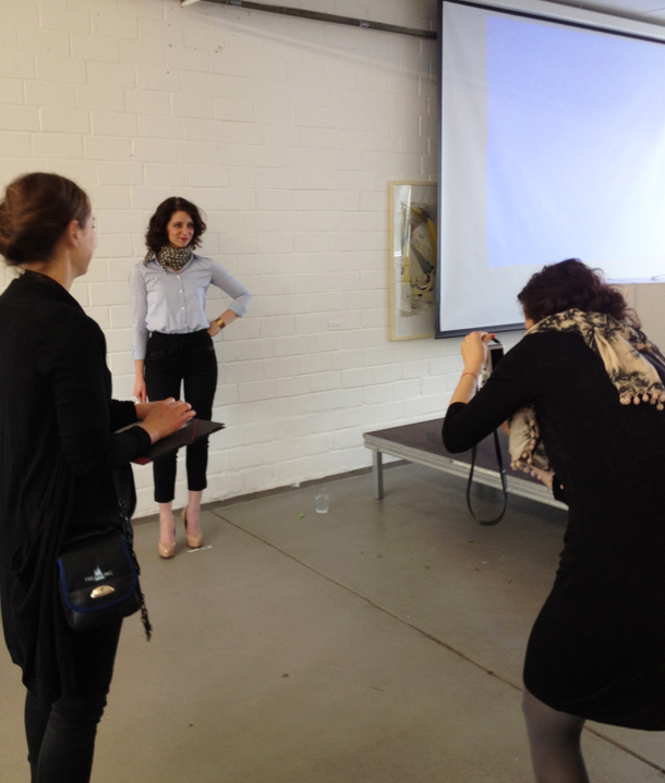
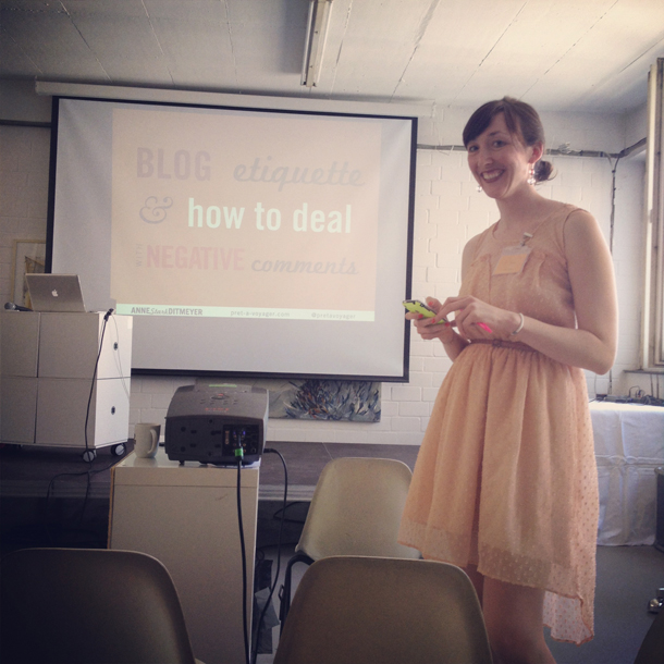
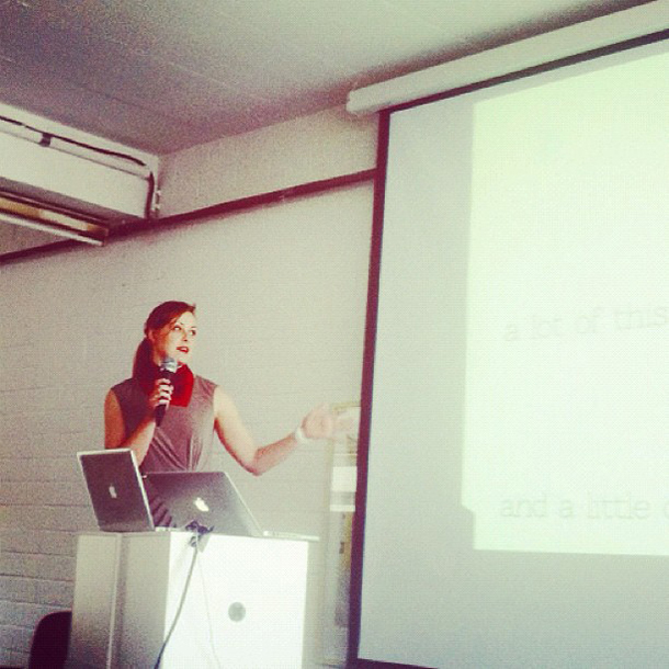
Last weekend I spoke at The Hive blogging conference in Berlin about how to create a great DIY tutorial for your blog. I so enjoyed speaking about something I actually am quite passionate about – communicating. I thought it would be fun to share here what I talked about!
I think some of you are thinking this post won’t apply to you. But it will! If you’ve ever struggled to figure out how to explain how to do something – crafty or otherwise – this post will apply to you. And if it doesn’t, at least you get a little glimpse behind the scenes at what I think about when I’m writing a DIY post!
 The wonderful organizers of The Hive asked me to speak about how to create a great DIY tutorial. I’m by no means an expert on DIY tutorials, but I found I certainly had a lot to say!
I decided to break my presentation down into three parts: Inspiration, Communication, and Presentation. If you can find the right combination of these three, you’re in business.
 For a great DIY, you’ve got to start with a great, clever idea.
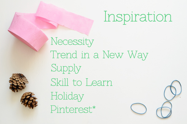
When I’m looking for inspiration, I always start here:
Is there something I need to make because I can’t find it anywhere else, or because it’s too expensive to buy?
Is there a space I can fill – a wall, or a friend’s wall?
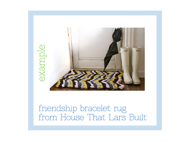
Is there a trend I can spin in a new, creative way (see example below!)?
Do I have a supply to use up – like old frames taking up space in the shed?
Is there a skill I want to learn? A holiday coming up?
And finally, is there something I saw on Pinterest that I wanted to try myself? Pinterest is a little tricky, because you don’t want to just copy what’s out there. But if you’re crediting the source of your inspiration as well as giving it a different spin, that’s okay.
I think what to remember here is to stay true to what you actually like, what your taste is, and to think creatively. If you’re constantly just catering to trends, your readers will know and it won’t do you or your readership numbers any good. You’re just going to be left with a whole house full of chevron striped stuff that I’m certain will eventually drive you nuts.
 Brittany’s friendship bracelet rug is a great example of using an overdone trend in a really clever, likeable way.
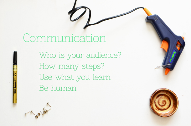
 Next up is communication, or the words you’re using.
The most important thing you need to be thinking about when you’re writing is your audience. Picture who it is you’re talking to. You know your readers – where they come from, what they might have access to, what they’re interested in.
The second thing to keep in mind is the attention span of your reader. You want to give your reader enough information so that they understand each of the steps clearly, but not so much information that they give up reading halfway through.
Tell your readers what to expect so that when they’re replicating the project, they don’t panic. Tell them what you learned – if you learned that it’s better to let the paint dry overnight after each coat even though it doesn’t say that on the paint can, tell them that.
Sometimes I totally screw up steps the first time around. That’s okay to admit. Do you really want to show the photos of the mess in your post, probably not, but it’s okay to admit you screwed up and then you figured out the right way to do it.
If I’m worried that a project makes sense, I test it on a friend first. It’s better to double check than to have a DIY post that no one ever does because they can’t picture how you got from A to B.
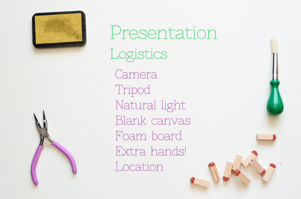
 So you’ve got your great idea, you’ve written about it and figured out all your steps. Now we’ll talk about the visual presentation. That means photos. Let’s talk about the logistics of getting good photos. Here are the basics of what you’ll need.
Camera: Now I’m not saying you have to go out and buy a fancy camera. In fact, I think my iphone takes better pictures for me than my DSLR some days. But you need photos to show your readers what the end result is supposed to look like – to impress them with your project.
Tripod : A tripod is not always necessary, but can be so helpful if you’re trying to take photos where you need to be doing the steps. But it’s crucial if you work alone and you don’t have someone to take photographs for you. And it tends to make photos more clear.
A blank canvas in white or light neutral. Lots of people use painted pallet boards. I use a piece of a white door that my neighbors were throwing away. You just want something that will allow you to highlight the project you’re doing – you don’t want something that will compete with your project.
Natural light: I have a tough time with this sometimes because Dublin can be so darn dark and gray. But you want natural light. Artificial lights will turn everything funny colors and create shadows that are really hard to avoid.
Foam core or white poster board: I use a sheet of foam core to reflect shadows – the white surface just reflects light into spots that are dark. I find it really helpful to get a good, bright shot.
Extra pair of hands: I often ask my sister-in-law to help me either take photos or set up shots. It’s amazing what a help an extra pair of hands can be when you’re trying to shoot a DIY tutorial.
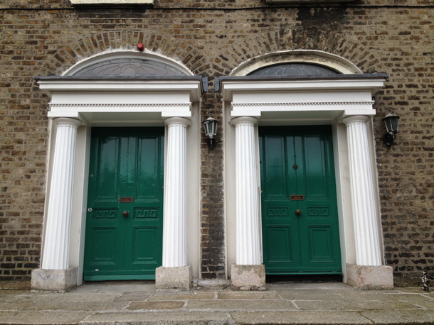
Location: Sometimes photographing your project in a pretty setting can make it really stand out. That’s why I’m always using those Georgian doors instead of my own front door!
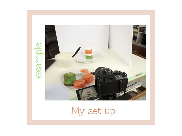
 That’s what my set up looked like for this St. Patrick’s Day cake. How sneaky, right?!
 So, there you have it! The somewhat condensed version of my presentation last weekend. If you have questions, please ask – I’m happy to help! Or if you love creating DIYs, let’s hear your suggestions in the comments! What are your tricks of the trade?
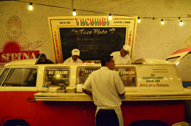 Get the tacos – maiz y poblano, barbacoa beef, and frijolitos con queso. Just divine.
