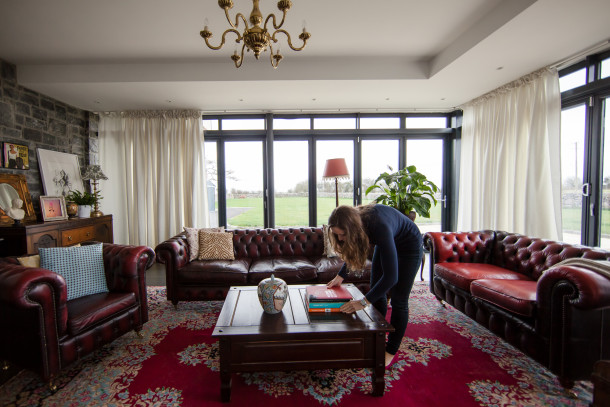
When I mentioned my recent styling work last week, I said I’d write a little post about styling since most of my friends can’t believe it’s even a job. So this post will serve as an explanation for what I mean when I say I was out styling a house. A little House Styling 101, if you will.
A lot of my friends and family were surprised to learn that almost all interiors photographs you see in magazines aren’t the way those houses look every day. When I’m styling a home, I work with a photographer, and we’re concerned with how the home looks in photos and how it will look on a screen or printed in a magazine. Most homes look lovely when you’re in them, walking around or sitting on the couch. But for a photograph, they’re only two dimensional, so they need to look balanced when it comes to the size of furniture, the placement of colors, and the angles of everything. Styling a home to be photographed for a magazine is totally different than styling it to live in.
A lot of homes only require accessories, and some homes require furniture. Last week, we brought four dining chairs to style the kitchen/dining room for House Beautiful, along with bagfuls of white bowls, plates and jugs. Here’s another little secret: most of the accessories I bring are borrowed from stores and then returned. Then I usually grab a bunch of things from my own home in a panic as I’m running out the door. My biggest fear is not having enough options when I get to the location. Then I’m really stuck.
So here’s the run-down of the top five things I do when I get to a home that needs to be styled for a photographer:
1. De-clutter!
I strip bookcases and start over again (and often wish someone would do this to my shelves!). I move charging cords and anything that might be useful but not visually pleasing.
2. Bring in fresh linens
Tea towels, bath towels, place mats and napkins, table runners and table cloths. They’re all carefully chosen to either add pops of color or to tie in colors that need a little unification across a space.
3. Fluff and arrange pillows
Pillows look great when they’re fat and puffy, rather than squashed and sat on. They also look great when there are bunches of them, which really annoys me in real life.
4. Straighten rugs, couches, furniture
You’d never notice it in real life, but the lines of rugs and couches make a huge different in photographs. Sometimes we have to exaggerate the lines for photographs as well.
5. Add fresh flowers and fruit!
The funny thing is that even flowers have to have a little thought put into them. For most photographs, I use flowers that don’t show their season. I love tulips in real life, but they scream spring. Not great if the photos are going to be published in November! Big bowls of apples or limes or oranges add lots of color and are really useful when I forget my lunch. Well, the apples, at least. The limes, not so much.
So that’s my Styling 101 lesson for today. It’s surprisingly physically and mentally exhausting, but it’s really fun when you see the photographs and they look like the house belongs in a magazine!


2 Comments
This is completely fascinating. And makes me feel great about my highly-functional-but-never-going-to-be-in-a-magazine space! Sounds like great work, Emily!
[…] currently trying to source a coffee table for a house I’m styling on Thursday and it’s proving rather difficult. Beautiful coffee tables for mid-century modern […]