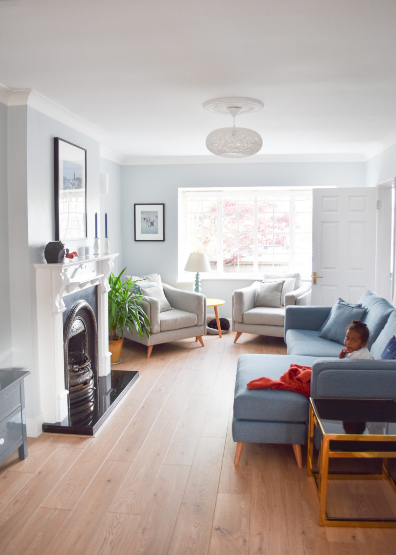
 It’s reveal time! Three and a half months ago, we moved back to Dublin and immediately started work on our house. We’ve done so much in a very short time! There’s still a ton left to do, but it’s close enough to show you how it’s looking currently and to have a fairly satisfying before-after photo situation.
I explained before that Michael helped our builder, Julian, take out part of a wall to make our downstairs essentially one big, long room. So this living room is a piece of that space. I’ll share the kitchen next and at some point, when I get around to finishing the toy organization situation in the little sunroom/playroom, I’ll share that as well. There’s also a downstairs bathroom that I was pretty sure was going to be my first after reveal, but I failed to calculate how much wallpaper to order before my mom brought it over, so I’m about a roll short and trying to decide whether to wait until our next visitors come over from the States or to try to DIY some sort of stencil myself. We shall see!
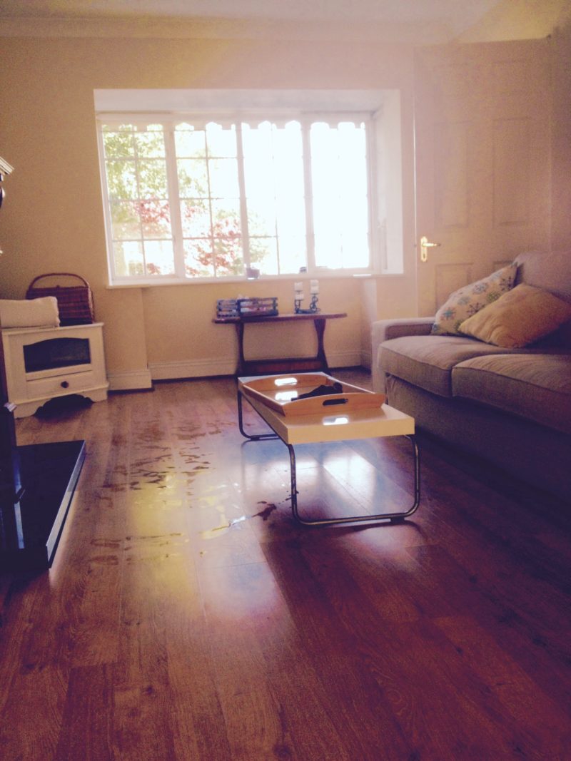
Down to the room at hand. Our living room, with a big bay window that lets in so much light and a gas fireplace we haven’t yet tried. It previously had double doors between the kitchen/dining area and the living room, but we knew we’d never want to close them, so Michael had the brilliant idea of taking out about 18 inches on either side and above the doors to almost totally open it up. They had to install beams or something because the wall was load bearing, but it made the biggest difference of any of the changes we made.
And just one note: this is our day-to-day styling. I came home yesterday and Laura, our amazing nanny, had the place looking so great (thanks, long napping Noah!) that I tidied up the kids’ shoes and the Tupperware Noah always digs out of the cupboards and took photos as fast as I could. From where I sit writing this, I can see a toy and a rogue grape under the couch right now. Maya has put the couch pillows in the cat’s bed (oh, I didn’t even bother moving the cat under the yellow table!) at some point this afternoon. And while it’s not perfect styling, it’s how you’d find our house if you gave me about 30 minutes notice (or if Laura had just left, ha!), and I like that. Not perfect, but perfectly our little life.
So to refresh your memory, here’s before in all its butter yellow glory:
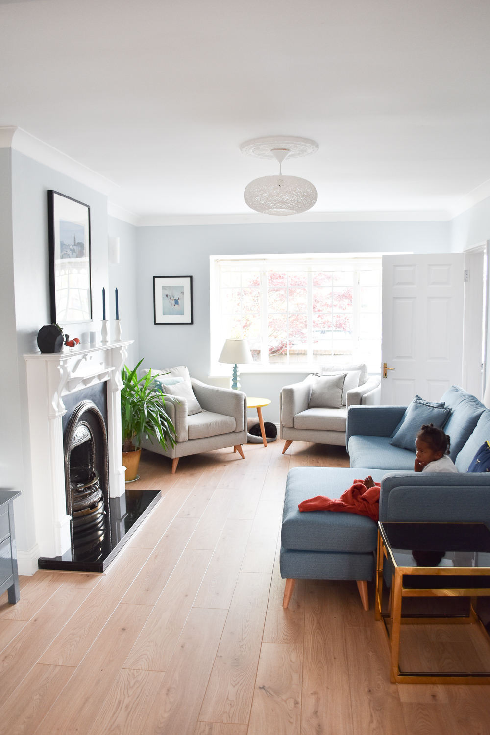
 And after! Painting the walls, changing the really low light fixture that Michael hit his head on every time he walked by, and switching the way the door opens — all really good changes for the flow of the house.
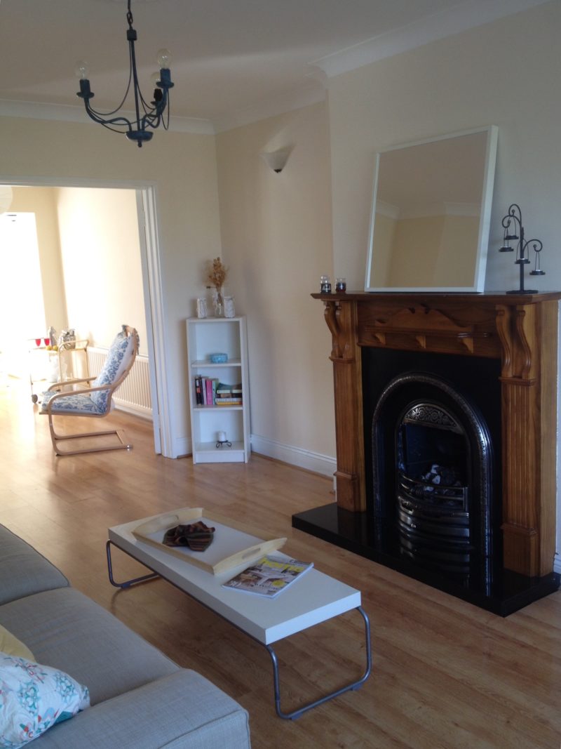
 And another before, with terrible, terrible sconces and the monstrosity of a fireplace.
 And after!
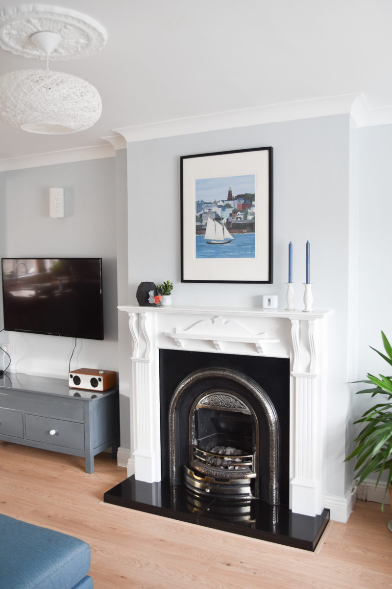 I originally had Michael and Julian take off the fireplace, thinking I’d do a really simple wood beam as a mantle, but there would have been plaster work to be done and it was way faster for them to whack it back on the wall and have it painted when the interior was painted. And I actually really like it now. I think you can appreciate the detail of the metal part a lot more. I still wish it didn’t have that second little mini mantle, but it’s not worth trying to rip off.
Oh, here’s another fun before view:
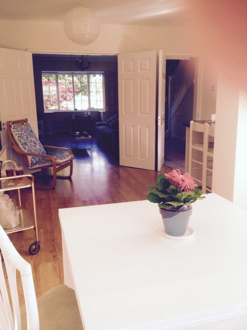 And after! It’s so much more open and bright throughout the whole house.
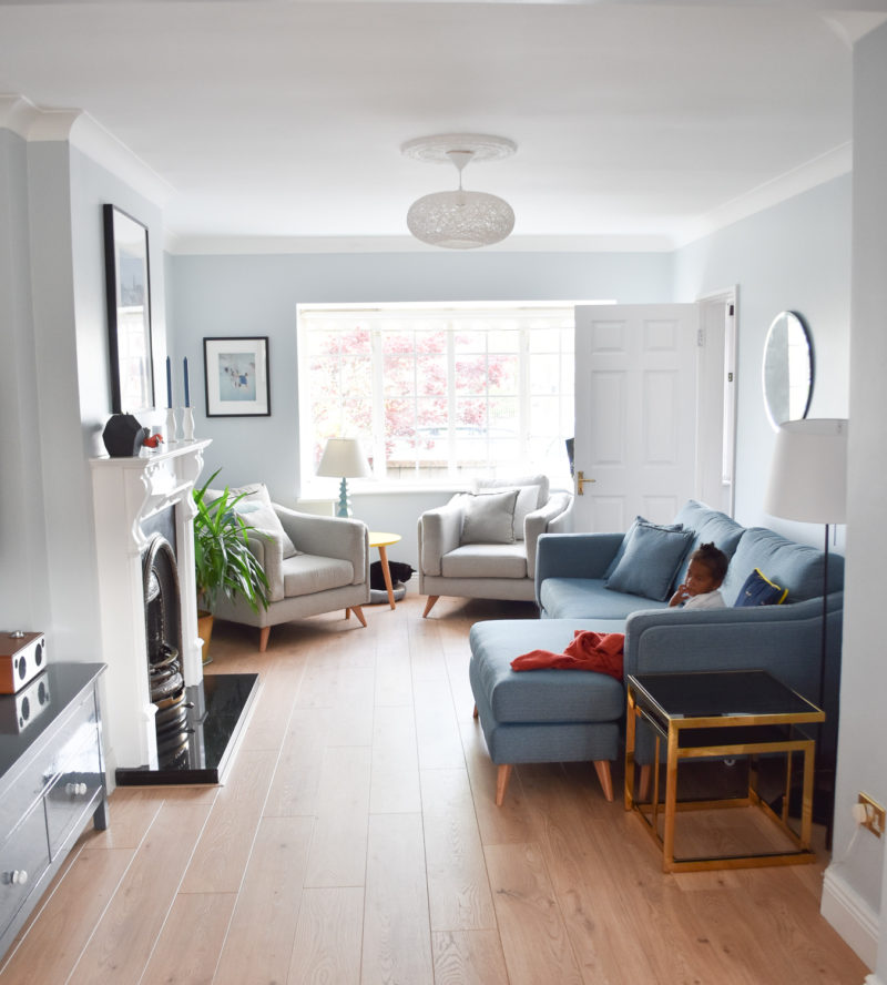 And of course, having all new furniture is the icing on the cake. When we returned from Houston, I got a very surprising email asking if I’d like to work with DFS, a furniture company whose work I’ve featured in my column in the Irish Mail on Sunday for the last year. Their styling is always impeccable and their furniture is the perfect mix of classic but modern. I responded very, very quickly that yes, I’d love to work together! It was especially timely because at that point, we had basically no furniture. Everything we had in our old apartment had been used to death by our old tenants, and plus, our old apartment was smaller and had a different layout than this. We were starting from scratch.
So we chose, if you can believe it, the Maya line from DFS. Isn’t that perfect? Michael was set on an L-couch shape, since he values lounging above all else in a couch. I was set on something that was kid-friendly but looked like we weren’t waiting until they were 18 to buy nice furniture. Like grown-up furniture that would withstand toddlers, which isn’t the easiest combo to find. But we did.
We found the perfect sofa and two very comfortable armchairs that fit the space and our varying requirements perfectly. I found out a few weeks after we got the furniture that had heard we had young kids and decided to treat it with Fabricoat. I was and am so grateful! Although we’ve done a pretty good job of instituting a new no-food-near-furniture rule that Maya at least understands pretty well. It’s tricky, of course, because the dining table is all of 15 feet from the couch and Maya absolutely never sits still, but so far so great. Even without the Fabricoat, the sofa and armchairs have a special certification for strength and durability called Kitemark, that means they go above the basic industry standards for quality. So they’re ready for Maya and all her usual jumping and climbing!
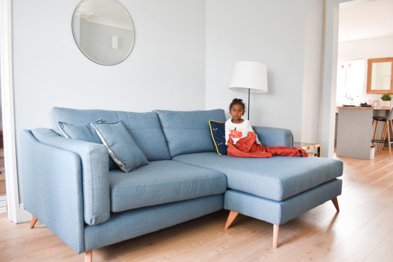 Maya’s been sick (her third coughing cold thing in 6 weeks, ugh), so she actually was sitting still and lounging while watching a little television. I love how she makes the sofa look huge. When you see Michael on it, you’ll see the real scale, which is pretty perfect for the size of the room. I asked her to say cheese since she wasn’t looking too perky. Here’s what I got. Ha!
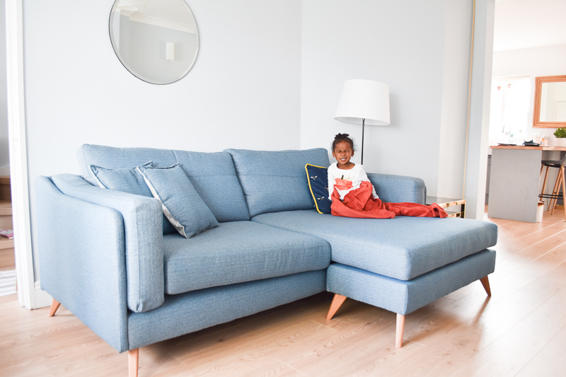 I have two frames that will probably go beside the circular mirror, but choosing photos and getting them printed was taking me much too long and I actually like how peaceful it is for the moment. I’m trying not to clutter up the zen of the room with too much on the walls. And one day, when my kids are like ten and not as liable to spill everything, we might get a rug. But for now, I think it keeps the room more open and a heck of a lot easier to clean.
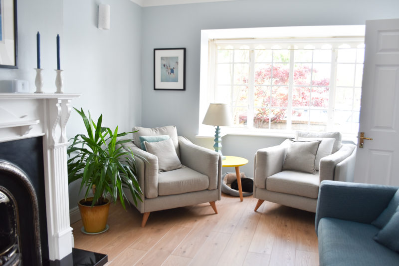 I do have every intention of finding a few more colorful and textural pillows to mix in the bunch, but the chairs and sofa came with pillows, so we’re definitely not short on comfort! There just doesn’t seem to be loads of time to go shopping for throw pillows, go figure.
When the armchairs arrived, I panicked because they were replacing a space that was previously empty, so they felt enormous. After about a day, we realized they were just perfect for the space. And I’m sitting in one as I write this and they’re so comfortable. They make me feel rested and relaxed, even when at least one toddler is trying to crawl all over me.
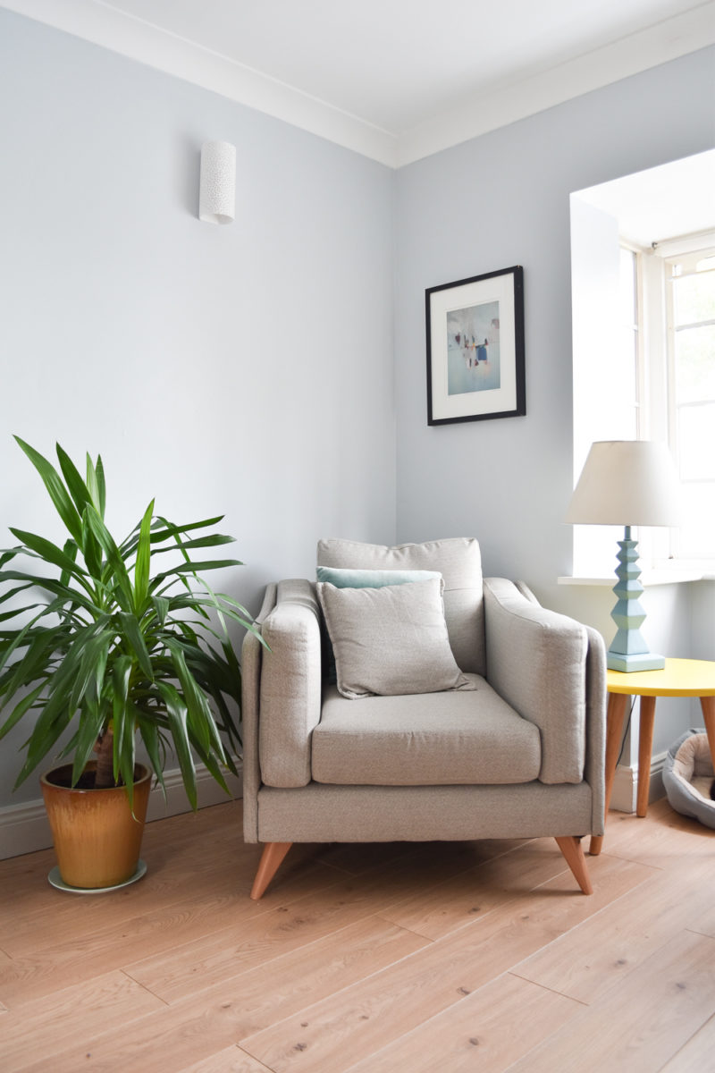 The side tables are from the Twist nest of tables at DFS as well (the pink one is in Maya’s room), and while yellow isn’t usually a color I choose, it’s a nice pop in an otherwise cool room. The square tables on the end of the couch are also from DFS, the Alpha set, and they’re very convenient when we have guests because one slides out from inside the other. We can sort of use one as a coffee table in the nook of the couch for extra drink placement. They are always, always covered in tiny finger smudges and I can’t even be mad.
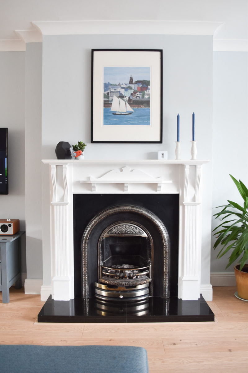 My brother gave us that print one year for Christmas, it’s a painting of Portland, Maine, and it fits perfectly above the mantle. It’s framed in an Ikea Ribba frame, but the mat is custom and the whole thing is professionally secured at the back, which keeps it from sagging, which is my usual complaint about large Ikea frames. Little pro tip there for ya!
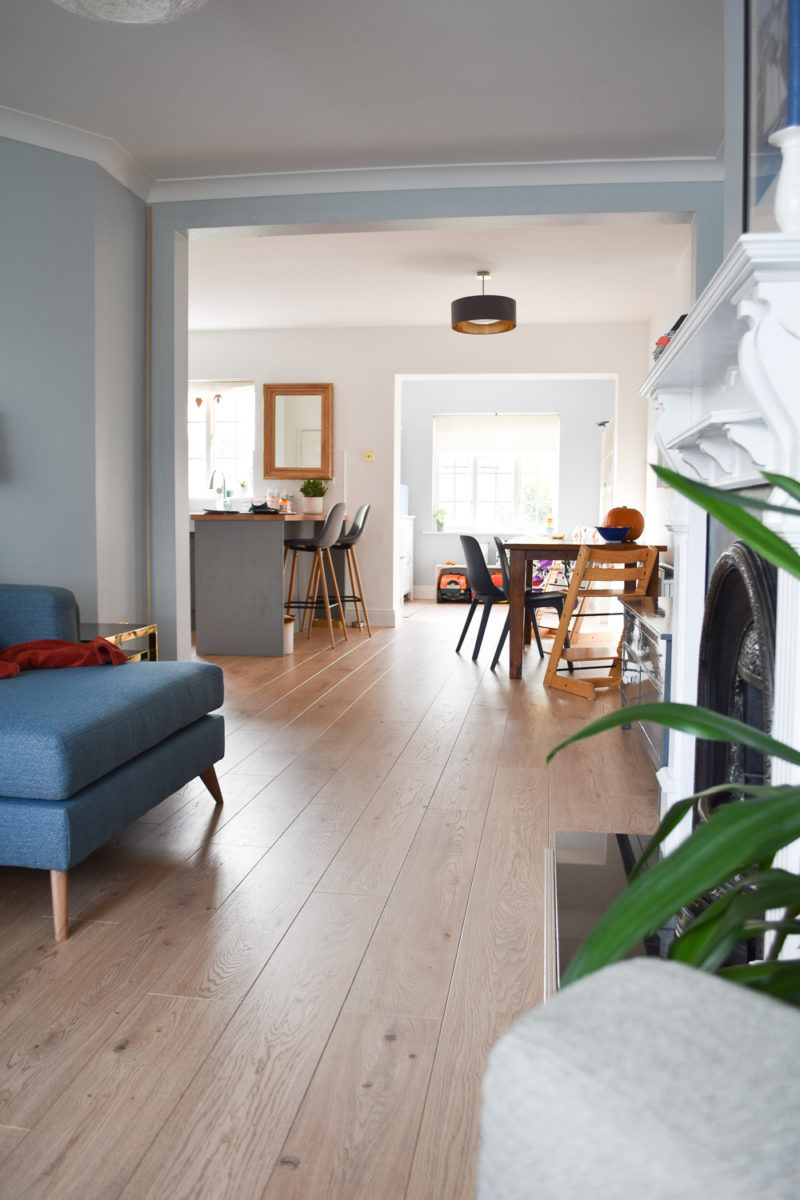 And that’s a little peek into the kitchen/dining/playroom area that I’ll share next week! We’ve definitely come a long way since the before version of this house and we appreciate it all the time. It’s the perfect amount of space for our family — for now at least!

No Comments